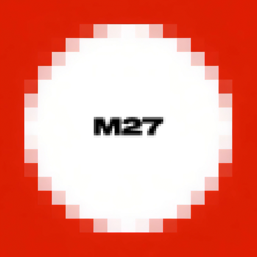
→ M27 // VISUAL IDENTITY & branding
With a group of friends, we founded a Latin American esports team called M27. To position ourselves among the most competitive teams, with a strong focus on technology and aesthetics, we explored visual codes, formats, and color palettes that could instantly evoke those ideas.
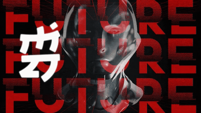
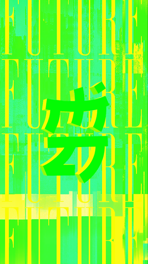
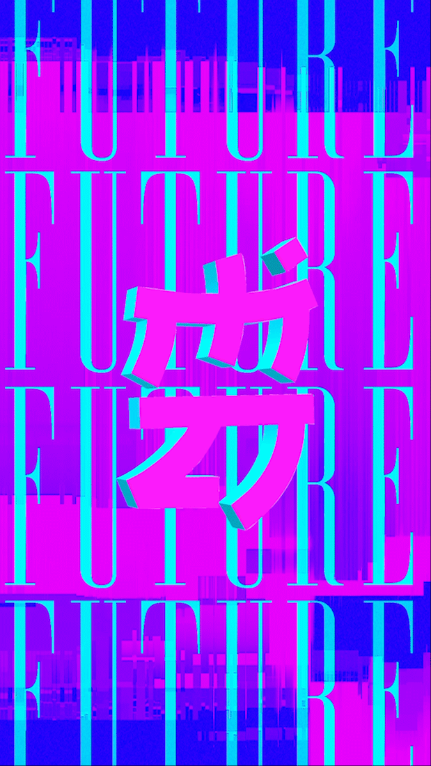
During that exploration, we found a strong connection between Asian visual language and the concepts we wanted to express: technology, competition, and beauty. The geometric simplicity of these characters inspired us to design a logo for M27 that, without literally replicating any symbol, became an elegant exercise in form and function.
You can follow our team on Instagram.
Here a quick look of the design and applications.


TEAM
CLAUDIO URETA - CARTIBARRA - SEBA URRUTIA